


개요
이번 블로그는 Emotion 을 사용하여 Styled Component 형태로 스타일링을 진행하였다.
설치 및 개념에 대해서는 다른 블로그 혹은 공식홈페이지 를 꼼꼼히 읽으며 진행하였으며 현재까지의 개인적인 느낌에 대해 적어본다.
장점
Emotion 프레임워크를 사용하면서 느꼈던 장점이 많았던것 같다.
현재 실무에서 진행하고 있는 차세대 프로젝트인만큼 환경상 내맘대로 사용할 수 없는 부분이었다.
실제로 같이 진행하면서 써보니 장점이 굉장히 와닿게 느껴졌으며, 개인적인 느낌은 Vue 프레임워크 보다는 React 에 좀 더 적용하기 수월하다는 생각을 한다.
1. 편리함
가장 두드러진 장점은 개발하는데 있어서 가시성 확보가 크게 와닿았다.
이말은 즉, 개발을 하면서 각 Tag 별로 Naming 을 진행하기 때문에 Container, Wrapper.. 등등 나만의 기준을 세워서 컴포넌트별로 JSX 를 만들었기 때문이다.
import * as S from './Styles'
import CounterBadge from 'components/Common/CounterBadge'
import { getSvgJSXElement } from 'utils/Common/Common'
import { useDropdownEffect } from 'hooks/useDropdownEffect'

import type { CategoryCount } from 'types/Category.types'

/**
 * @description: Navigation Side Bar 최상단 Root Title 컴포넌트
 */

const CategoryRootTitle = ({ categoryCount }: CategoryCount) => {
  return (
    <S.RootTitleWrapper>
      {getSvgJSXElement('Dot', '18')}
      <S.CategoryRootIcon>{getSvgJSXElement('Ghost', '18')}</S.CategoryRootIcon>
      <span></span>
      <S.CategoryRootTitle to={`/?category=All`}>Root</S.CategoryRootTitle>
      <S.CategoryRootCount>
        {categoryCount['All'] !== undefined ? (
          <CounterBadge>{categoryCount['All']}</CounterBadge>
        ) : (
          ''
        )}
      </S.CategoryRootCount>
    </S.RootTitleWrapper>
  )
}

export default CategoryRootTitle
위 코드를 볼 수 있듯이 RootTitle 에 대한 컴포넌트이다.
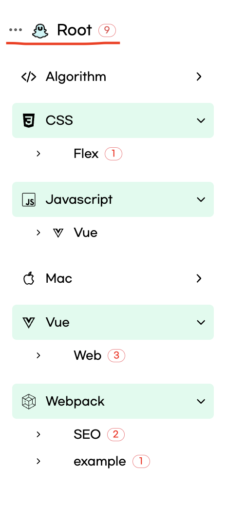
우리는 여기서 명시적으로 RootIcon(이모티콘), RootTitle(타이틀), RootCount(숫자) 로 나뉘어 진 것을 볼 수 있다.
개발을 하는데 있어서 TS 로직 혹은 Styling 을 하는 중에도 전체적인 계층 구조를 쉽고 명확하게 해당 태그가 어떤 태그인지 확인할 수 있고 분리가 잘되어 있어서 정말 편했던것 같다.
2. 재사용성
그다음으로 좋았던 부분은 재사용성이 크다고 느꼈다.
현재까지는 Button 같이 공통적으로 사용하는 Style 의 요소가 없어서 아직까지는 기능별 폴더하위 Styles 에 해당 기능에 대한 Styled 요소들을 모아놓았다.
이는 같은 폴더 내에서 같은 Styling 이 필요한 요소들은 손쉽게 재사용 할 수 있다는 장점이 있다.
추후에 전체적으로 공용할 수 있는 Styled이 생긴다면 더욱 편할것 같다.
3. Code 의 깔끔함
인터넷상에서 찾은 일반적인 html, css 를 활용한 간단한 Header 의 코드를 먼저 본다.
// 일반 코드
<!DOCTYPE html>
<html lang="ko">
<head>
	<meta charset="UTF-8">
	<title>2D Game Dev</title>
	<link rel="stylesheet" type="text/css" href="style.css">
	<link rel="stylesheet" href="https://use.fontawesome.com/releases/v5.7.2/css/all.css" integrity="sha384-fnmOCqbTlWIlj8LyTjo7mOUStjsKC4pOpQbqyi7RrhN7udi9RwhKkMHpvLbHG9Sr" crossorigin="anonymous">
</head>
<body>
	<div class="container">
		<header>
			<h2>2D Game Dev</h2>
			<nav>
				<ul>
					<li><a href="#">Introduce</a></li>
					<li><a href="">Game</a></li>
					<li><a href="">Dev tools</a></li>
					<li><a href="">Support</a></li>
				</ul>
			</nav>
		</header>
	</div>
</body>
</html>

@import url('https://fonts.googleapis.com/css?family=Noto+Sans+KR|ZCOOL+QingKe+HuangYou');

* {
	margin:0;
	padding:0;
	color:#000;
	font-family: 'ZCOOL QingKe HuangYou', cursive;
	box-sizing: border-box;
}

.fn-font {
	font-family: 'Noto Sans KR', sans-serif;
}

ul {
	list-style: none;
}

a {
	text-decoration: none;
	outline: none;
}

// Styled

const Header = (props: HeaderPropsType) => {
  const headerRef: MutableRefObject<HTMLDivElement | null> =
    useRef<HTMLDivElement>(null)
  const iconRef: MutableRefObject<HTMLDivElement | null> =
    useRef<HTMLDivElement>(null)

  const scroll = useScrollStateBar()

  const headerWidth = headerRef.current?.clientWidth as number
  const iconWidth = iconRef.current?.clientWidth as number

  const xScroll = (headerWidth - iconWidth) * 1

  return (
    <S.HeaderContainer ref={headerRef} backgroundImg={props.backgroundImg}>
      <S.HeaderBackgroundImg>
        <S.IconWrapper>
          <S.Icon ref={iconRef} scroll={xScroll * scroll}>
            {navIconSet['Rocket'].icon('15', '15')}
          </S.Icon>
        </S.IconWrapper>
      </S.HeaderBackgroundImg>
    </S.HeaderContainer>
  )
}
위 코드는 굉장히 간단한 코드이지만, 경험상 깊이있는 프로젝트를 진행하면 태그가 굉장히 복잡해진다.
그렇게 되면 가시성 측면, 기능별로 확인하는 부분에서 굉장히 편리한 것을 볼 수 있다.
그 외에도 많은 장점이 있지만, 이정도로 생략한다.
단점도 있을 수 있지만, 아직까지는 크게 단점을 느끼지는 못했던것 같다.
최종정리
여러 블로그를 보면서 Emotion 사용 예들을 정말 많이 찾아보았다.
실제 네이밍 규칙의 경우는 사람마다 다르고 정해진 규칙은 있지 않다고 느꼈다.
결과적으로, Naming 규칙의 경우 함께 일하는 팀에서 룰을 정해서 만드는게 일반적인 것 같고 개인적으로도 좋은 것 같다.
대표적으로 사용하는 규칙이 있지만, 이또한 협업을 위해 추천할 뿐이지 개발 생산성을 높힐 수 있는 규칙은 본인과 함께 일할 사람들이 만드는게 최선이라고 생각한다.